Monday, December 8, 2008

Star Plots

These are known as star plots. It is a method of displaying multivariate data. Each star represents a single observation. In this example each star is showing an observation about its major U.S. city.

http://www.math.yorku.ca/SCS/Gallery/images/starcrim2.gif

Correlation Matrix

This is a correlation matrix. It describes correlation among two variables. It is a square matrix in which the diagonal elements are always equal to 1.00. This particular matrix compares the genomes of livestock.

http://www.livestockgenomics.csiro.au/Genome_to_Phenome/matrix_corr_gt1SD.png

Similarity Matrix

This is an example of a similarity matrix. This matrix measures pairwise similarities of objects. The greater the similarity between the two objects, the greater the value of measure. In this case red represents the strongest similarities.

http://tomcat.esat.kuleuven.be/txtgate/images/distmat.png

Stem And Leaf Plot

This is a stem and leaf plot. The stem shows the first digit of the age. The leaf shows the last digit of the samples ages. So for this example 10 people where tested between the ages of 0 and 90 at the family reunion.

http://www.eduplace.com/math/mhm/5/06a/ts_5_6a_wi-1.gif

Box Plot

This is a box plot, it is used to show statistical measures such as the median, minimum and maximum. The whiskers at the ends of the lines represent the range and the line in the box represents the median. This example shows the data for the distribution of conditional residual by person.

http://support.sas.com/rnd/base/topics/statgraph/proctemplate/images/boxplot.gif

Histogram

This is an example of a histogram. It is used for for relaying several types of data. It gives the general shape of the frequency distribution. It gives the symmetry of the distribution. It also shows modality as well as skewed data.

http://www.labsystems.ro/histo-1.jpg

Parallel Coordinate Graph

This is an example of a parallel coordinate graph. Multivariate relations are gained using this graph. It is used to show numerous sets of data while still keeping some connectivity.

http://www.stat.columbia.edu/~cook/movabletype/mlm/mdg1.png

Triangular Plot

This is an example of a triangular plot. It is used to show the relation between three variables. In this case it is showing the relationship between modern races and their ancestry.

http://upload.wikimedia.org/wikipedia/en/thumb/a/a0/Admixture_triangle_plot.svg/356px-Admixture_triangle_plot.svg.png

Windrose

This is a Windrose. It is used by meteorologists to show the relation between wind speed and direction at certain location. In this windrose colors are used to indicate wind speed and directions have been labeled to show the winds movement.

http://www.climate.washington.edu/windrose/Seattle-WindRose.jpg

Climograph

This is an example of a climograph. It is used to depict the monthly precipitation and temperatures in a given area. The bar graph represents rainfall and the line graph shows temperature. This is a climograph for Miami, Florida.

http://drought.unl.edu/whatis/climographs/clim-mia.gif

Population Profile

This is a population profile. It is a chart showing people as a function of their age. This chart shows the ages of men and women as they compare to the percentage of the population.

http://camellia.shc.edu/literacy/tablesversion/assignments/Image2.jpg

Scatterplot

This is an example of a scatterplot. It is ued to compare two variables in order to find a correlation. It is useful with a regression line which is the purple line on this graph. It aides in finding positive and negative relationships.

http://www.neiu.edu/~sljanows/391/scatter.jpg

Index Value Plot

This is an index value plot. This chart is used to display data in a clear manner in order to avoid discrepencies. This example is showing the average streamflow for the U.S. in 2001. It uses monthly units to measure the changes in the variable.

http://water.usgs.gov/waterwatch/regplots/pa07d/pa07d_us_2.gif

Lorenz Curve

This is a Lorenz Curve. It is often used to represent income distribution, comparing households to income proportionately. In this graph, they are comparing the percentage of land to the population between 1951 and 2001 in decades.

http://www.staff.ncl.ac.uk/s.alvanides/grpopchange/Lorenz-Gini.gif

Bilateral Graph

This is a bilateral graph. It shows data on both sides of a zero line. This is a useful tool when you have both positive and negative data. In this graph they compare incomes to percentage of population.

http://www.financingwaterforall.org/uploads/pics/graph11_ODA.gif

Nominal Area Choropleth Map

This is a nominal area choropleth map and it is used to display nominal information. The information is nominal because it cannot be categorized or measured. In this map it displays the countries of Africa.

http://mapmaker.rutgers.edu/355/africa_political.gif

Unstandardized Choropleth Map

Here is an example of an unstandardized choropleth map. It displays information but it is given in totals for specific areas. In this map vacancy by zip code is displayed using colors. To represent the totals, zip code borders where used to group them.

http://www.sfu.ca/unigis/images/price10.jpg

Standardized Choropleth Map

This is a standardized chloropleth map. It is showing standard areas like census borders. In this map we can see the percentages of children under 14 within those borders.

http://www.statcan.gc.ca/pub/92f0138m/2008003/figures/figure3.1-en.jpg

Univariate Choropleth Map

A univariate choropleth map shows one singe variable. In this particular map the variable being used is the amount of people who are democrat or republican in the 2004 presidential election.

http://www.princeton.edu/~rvdb/JAVA/election2004/purple_america_2004_small.gif

Bivariate Choropleth Map

A bivariate map shows two variables on a single map. It combines two different sets of graphic symbols and colors. In this map it is showing the change in divorce rate from the years 1980 and 1990.

http://www.pop.psu.edu/images/gia/maps/changeanim.gif

Unclassed Choropleth Map

For these kinds of maps the data does not have to be classified. In this certain map they are depicting vegetables harvested for sale in 2002 across the United States.

http://www.nass.usda.gov/research/atlas02/Crops/Vegetables%20and%20Melons%20Harvested/Vegetables,%20Acres%20Harvested%20for%20Sale-choropleth%20map.gif

Classed Choropleth Map

This kind of map uses different shading to depict different issues. This certain map is showing the number of males to 100 females in the U.S.. The chart to the left will categorize the states accordingly.

http://www.ilstu.edu/~jrcarter/Geo204/Choro/map-AmFact-6eqint-orange-80pct.jpg

Range Graded Proportional Circle Map

This map shows Urban population. It shows this information by the different size circles according to the size chart to it's right.

http://mapmaker.rutgers.edu/355/dotProporCircle.jpg

Continuously Variable Proportional Circle Map

In these maps the circles are used to show the proper proportions of data. The chart is used to directly correlate the information in the circles to the chart. In this specific map the data in the map refers to major industries over in Europe.

http://www.lib.utexas.edu/maps/europe/west_germany_ind_1972.jpg

DOQQ

DOQQ is a digital raster image of a aerial photograph in which displacements caused by the camera and the terrain have been removed. It combines the image characteristics of a photograph with the geometric qualities of a map. This is a DOQQ of the bottom part of Louisiana.

http://www.lacoast.gov/maps/doqq/lamap_for_doqqs2.gif

DEM

Digital Elevation Model, DEM, is a GIS raster layer representing elevations. It is used for geographical and topographical data. In this map it is a DEM of Scotland.

http://www.geo.ed.ac.uk/home/scotland/scotland_dem_map.gif

DLG

DLG stands for digital line graph. A digital data format used by the USGS for large scale digital topographic maps including data from the base map categories such as transportation, hydrography, contours, and public land survey boundaries. This map is a DLG put into different sections of the U.S..

DRG

A DRG, or also known as a digital raster graphics, map is a scanned image of a U. S. Geological Survey standard series topographic map. DRG's are used as the basis for the USGS DLG files and DEM files. They are usually scanned at 250 dpi. This DRG is of the entire U.S..

http://www.drgmaps.com/map.gif

Isopleths

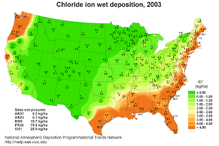
Isopleths are contour lines used on meteorological charts in order to show connecting points for some equal value in variable. Isopachs, isohytes and isotachs are all types of isopleths. This example illustrates the equivalent values of the chloride ion wet deposition.

http://nadp.sws.uiuc.edu/isopleths/maps2003/cldep.gif

Isopach

This is an example of an isopach. Isopachs are lines used to show the contour of ocean and sea depths. In this map yellows and reds are used in order to further show the contours of the area.

http://www.geo.utexas.edu/faculty/barker/kempter/rbtephra.gif

Isohyets

This contour map shows us the levels of rainfall using isohyets. Isohyets connect areas using lines to show equal levels of rain. In this example, it seems that there are much higher levels of rainfall near the center of this state. The coastline areas get a significantly lower level of rain.

http://www.trc.govt.nz/environment+online/rainfall/images/july08isohyet.jpg

Isotachs

The lines found on this weather map are known as Isotachs. Isotachs are similar to isobars, but rather than represent pressure they portray connecting points with equal wind speed. Usually winds will be constant in the areas and be congruent to air streams.

http://www.atmos.washington.edu/~mcmurdie/oct96/isotach_height_300.gif

Isobars

This is weather map showing isobars. Isobars are lines drawn to connect points of equal pressure. These values are generated from mean sea level press reports. Their values are given in millibars.

http://www.csulb.edu/~rodrigue/geog140/isobarsnewzealand.gif

LIDAR

LIDAR stands for Light Detection and Ranging. It is similiar to Radar, but it uses light rather than sound in order to find its particular targets. Once the light hits the object of interest it relays the color and distance back to the source. This is a shot of Oregon land using LIDAR. This technique is used in almost every field of industry.

http://westlinnoregon.gov/files/gis/lidar.jpg

Doppla Radar

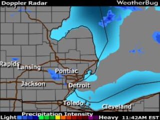
This is an example of Doppler Radar. It is a radar that uses returned echoes in order to pinpoint targets and measure their velocity. This image shows the precipitation intensity in the greater Detroit area. It has become so popular for predicting weather that many people forget it is also used in air traffic control, police speed guns, and radiology.

http://radarimg.weatherbug.com/images/AWSRadars2/bugradar/47/radar0.60.jpg

Black And White Aerial Photo

Black and white aerial photos, like infrared photos, are useful for monitoring areas of interests. This process has been used for numerous military attacks and planning. This photo clearly shows how an airport can be monitored in order to observe damages or threats.

http://www.expertgps.com/images/aerial-photo-boston.jpg

Infared Arerial Photo

Infared aerial photos are used to document changes in the environment as well as monitor numerous agricultural interests. This photo shows the outskirts of the Dallas area, which could be useful in planning and overseeing the land and property.

http://www.outintheboonies.com/Hal_Scott/doq_map.jpg

Cartographic Animation

Cartographic animation uses animation as a visual statement. It evolves to reflect changes in values and elements of interest over time. The use of cartographic animation has become more relevant with the advancements of computers. This example shows the evolution of the Omoha Park & Trail System.

http://images.google.com/imgres?imgurl=http://maps.unomaha.edu/AnimArt/ActiveLegend/swanson.gif&imgrefurl=http://maps.unomaha.edu/AnimArt/ActiveLegend/Peterson.html&usg=__Ic65wuVghIcp5sXHX_2QxNTNuRM=&h=251&w=295&sz=9&hl=en&start=24&tbnid=KZZ1t6Imj3FwdM:&tbnh=98&tbnw=115&prev=/images%3Fq%3Dcartographic%2Banimation%2Bmaps%26start%3D18%26ndsp%3D18%26hl%3Den%26rls%3Dorg.mozilla:en-US:official%26sa%3DN

Statistical Map

A statistical map is used to show the importance or the interest of a particular theme. They are also known as distribution maps. This example shows the importance of military increases and decreases in military efforts for this area.
http://www.denvergov.org/Portals/335/images/SOPA_oth02.jpg

Cartograms

Cartograms are maps that are usually used to show travel time, Gross National Product or population. The geometry of the map is distorted to convey the information. In this example the sizes of countries have been skewed to reflect the differences.

http://www.thedailygreen.com/cm/thedailygreen/images/IE/pop-2050.jpg

Flow Map

This is an example of a flow map. This type of map is used to show the movement of objects from one place to another. It is often used to show migration of people and the shifting of resources. In this case, it is showing the movement of something from Europe.

http://infosthetics.com/archives/flow_map_layout.jpg

Isoline Map

An isoline map uses continuous lines to join points of the same value. These maps are often used to show elevation, water depth, temperature and wind speed. This example also incorporates colors to reflect the changes between the numerical values.

http://www.geocities.com/miroslavdressler/print3.gif

Proportional Map

This is an example of a proportional map. It uses circles to reflect the population's size by district. The circles are set to scale to show the difference between large and small populations, i.e: the larger the circle then the larger the population and the smaller circles are less populated.

http://www.neighbourhood.statistics.gov.uk/HTMLDocs/images/BP%2520Maps5_tcm97-50745.jpe

Choropleth Map

A choropleth map shows differences by using shading or colors. This is an example, it shows the difference between voting power amongst the U.S. The darker colors show the high levels of voting power. By using shading they can clearly express the range of power between the states.

http://www.cartisan.com/map_resources/map_types/images/choropleth.jpg

Dot Distribution Map

A dot distribution map is used to show quantitative data as a dot. These dots represent certain phenomenon within the borders of a particular area. They also reflect the locations an event is most likely to occur. This map shows the level of military youth in Ohio.

http://operationmilitarykids.ohio4h.org/resources/images/dotMap.gif

Propaganda Map

A propaganda map is used in order to persuade people and certain populations to feel a particular way about an issue. They were used successfully during World War I & II. This map is using propaganda to perpetuate Germany's victory.

http://strangemaps.files.wordpress.com/2006/09/sur-le-vif-germany-wins-001.jpg

Hypsometric Map

A hypsometric map is used in topographic surveying. It depicts the configuration of the earth's surface, known as "relief" This map shows the different elevations using shading.

http://www.rrcap.unep.org/centralasia/reapreport/Map/MOUNTAIN/map_2.jpg

PLSS Map

PLSS stands for Public Land Survey System. It is a way of subdividing and describing land in the U.S.. These kinds of maps are used to divide public domain lands. This map shows an area in Santa Fe that is divided using PLSS mapping.

http://octane.nmt.edu/waterquality/maps/CountyFigures/SantaFe.jpg

Cadastral Map

A cadastral map indicates legal boundaries and the ownership of property. It is a legal map for recording title to a property. This map depicts the different lots and properties or a certain area in the 1980's.

http://www.sli.unimelb.edu.au/research/publications/IPW/cadmapfig3.jpeg

Thematic Map


A thematic map displays the spatial distribution of an attribute that relates to a single topic or theme. Usually it displays a single attribute like land ownership, soil type, or population density. This map is showing the population distribution in the United States.

http://www.census.gov/geo/www/mapGallery/images/density90.jpg